2013年注定了响应式设计流行,它是网站设计的新的方向,从去年开始越来越多的网站开始使用响应式的设计理念,它能够帮助你开发一套界面并且能运行在所有不同分辨率的设备上,包括,PC,平板,或者移动手机。今天我们继续推荐给大家5款书签类型的测试工具,你可以方便的添加到你的书签中,并且在测试响应式网站的时候方便的使用。
Viewport Resizer
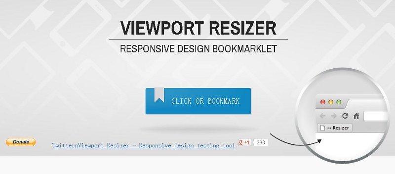
这个书签号称拥有158个国家3万多活跃的用户,主要特性:
- 完全自定制
- 方便的添加自定义尺寸
- 手动的横竖屏切换
- 自动的横竖屏切换 (portrait | landscape)
- 支持Media query
- 自适应Meta的viewport设置
- 手动重新加载页面
- 移除页面工具栏
- Viewport相关信息显示 (尺寸,分辨率,横纵屏,user agent)
- 支持触摸设备
- 支持vector
Resizer
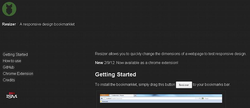
这个在线书签允许你快速的修改页面的尺寸来测试响应式的设计. 并且支持Chrome的扩展!
Bricss

另外一个方便的测试响应式的书签,你可以自己指定自己的几套显示窗口的尺寸。
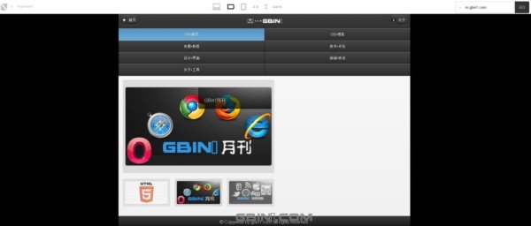
Responsinator

这个工具提供了仿真的web界面来测试你的响应式设计,不过呢,只是界面外面套了一个设备的壳子图片,如果你想查看实际的设备展示情况,还是应该使用真实的设备。同时,提供了一个书签,你可以方便的添加到浏览器中。
ish

这个在线书签刚出来不久,特点是不指定你的界面尺寸,随机的帮助你生成界面,你可以看到你的设计在不同的窗口尺寸下的显示特点。
Responsinator
Responsinator提供了大家在不同设备viewport下查看网站效果的特性,提供了iphone,android,ipad,kindle及其多种设备上的预览效果,你可以方便的看到需要支持的设备的响应式设计效果图。
Responsivator
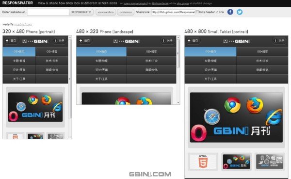
和responsinator不一样,responsivator提供了不同尺寸下的显示效果图
Responsive.is
responsive提供了5种设备下的预览效果展示
Responsive Web Design Testing Tool
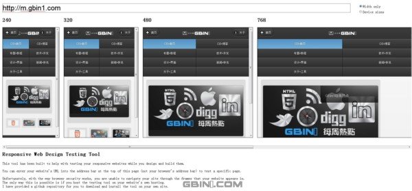
类似responsivator,但是界面更简单
Responsivepx
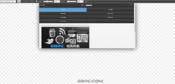
允许你用拖动的方式来修改窗口大小,模拟不同的设备屏幕
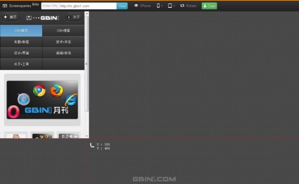
screenqueri.es
这个工具在gbin1以前的文章中我们曾今介绍过,如果想更多了解请阅读 分享一个帮助你在线测试响应式设计的web工具- Screenqueri.es,最有意思的是它支持localhost本地方式测试你的应用或者网站。
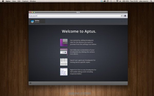
Aptus
一个工具类的浏览器,可以帮助你测试响应式设计
Bricss

一个帮助你测试响应式的书签,你可以方便的整合到你的浏览器里
Izilla Media Query Debugger
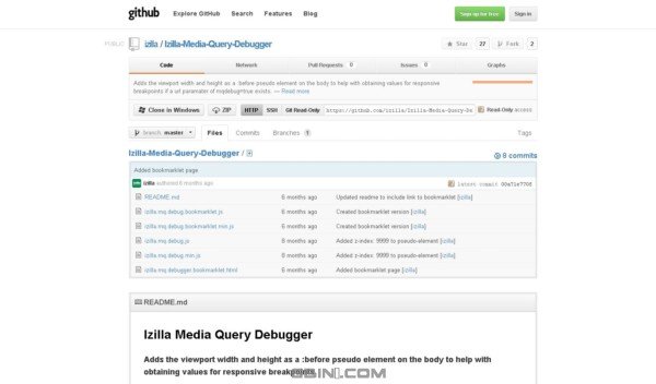
这个js可以帮助你添加伪元素到body元素上用来侦测宽高 ,当然你也可以使用他们提供的bookmark:http://izilla.com.au/git/izilla.mq.debugger.bookmarklet.html
Screenfly
支持4种设备的在线响应式设计测试工具,并且还提供相关开发的设计图和文档。具体请查看我们过去文章:分享一个在不同客户端查看网站的工具- Screenfly
Firefox Developer Tools
如果你使用Firefox的话,你可以直接使用开发工具实现,快捷键(Ctrl + shift + M)
ViewPort Resizer

另外一个书签式的工具
Jresizer

一个jQuery的响应式开发工具插件,帮助你创建响应式的窗口,方便你的开发和设计流程
Resize My Browser
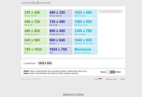
一个简单的帮助你创建指定宽高新开窗口的web工具
juicer
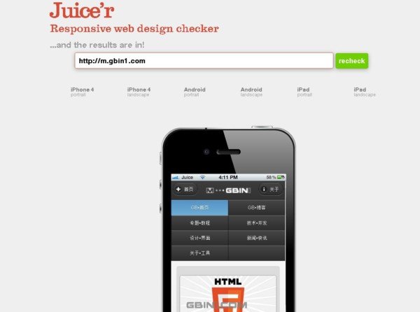
一个在线的展示响应式的工具,支持iphone,android等设备的显示,带有实物图。
转自前端观察